
AI Text-to-Image Generation
AI text-to-image generation composes a picture from a written description rather than retrieving one from a library — which is why the wording is the whole craft. This page explains what each part of a prompt actually controls, shows the same tool producing six unrelated mediums, and lets you run it yourself below. Free to test, no account needed.
Generate From Text FreeTry It Now — Free
Pick a medium, describe your subject on top of it, and generate. No account, no card, and the result is yours in about fifteen seconds.
AI Text-to-Image Generation
Choose a medium, describe the subject, lighting and viewpoint, and get a 4K image from text in about fifteen seconds
One Tool, Six Mediums — All From Text
Every image below came from the same AI text-to-image generation model with nothing changed but the words: a product photograph, a screenprint poster, an isometric render, a watercolour, a macro shot and an anime illustration.
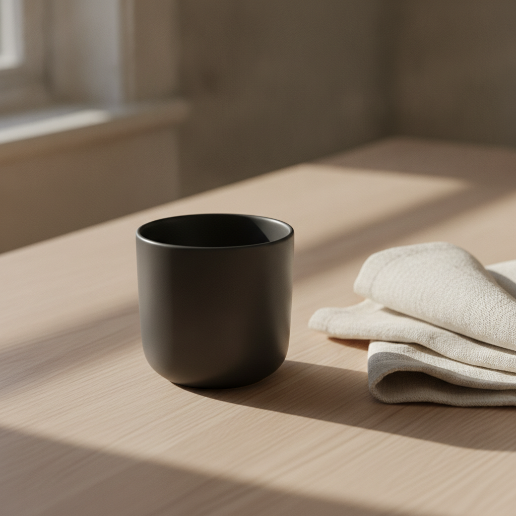
Morning Light Still Life
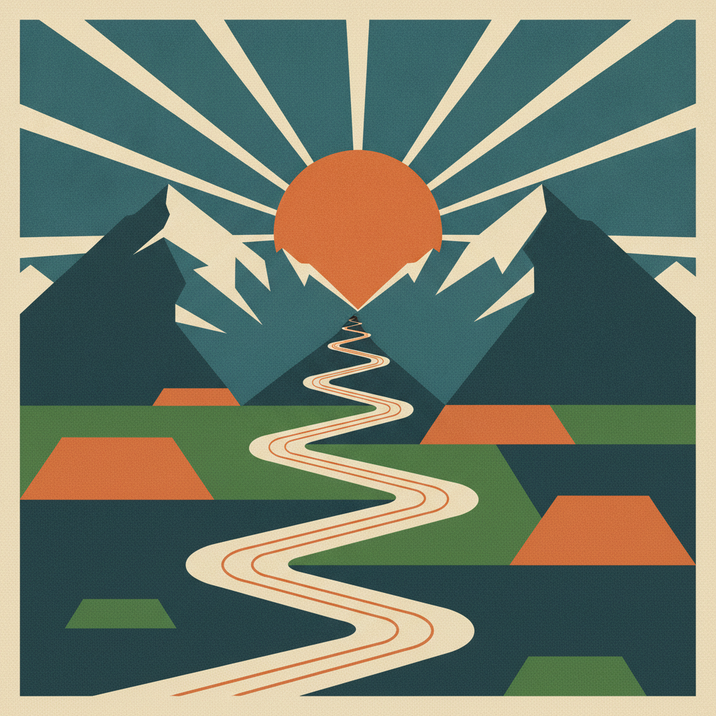
Screenprint Valley
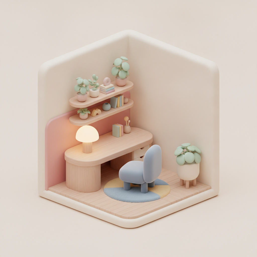
Miniature Workspace
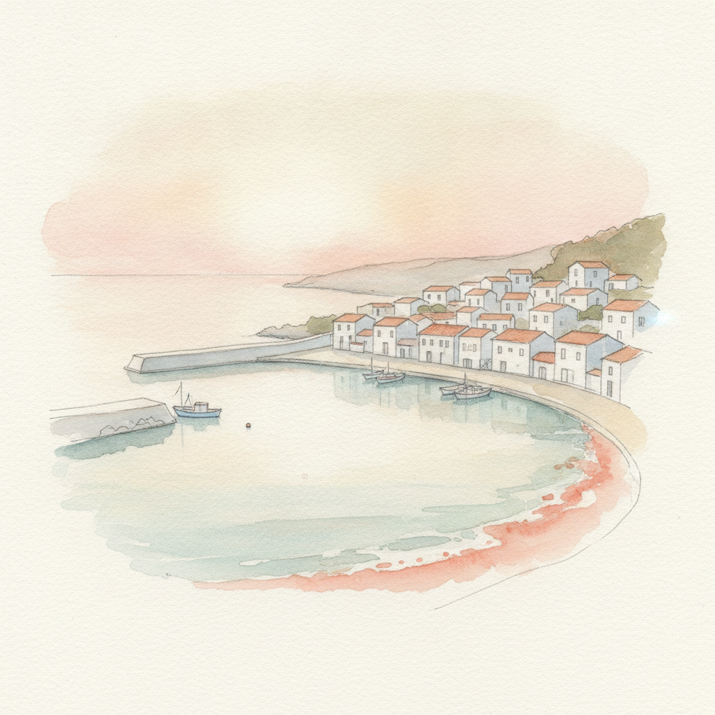
Harbour At Dawn
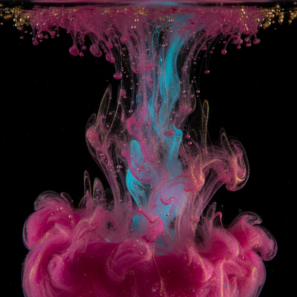
Ink In Water
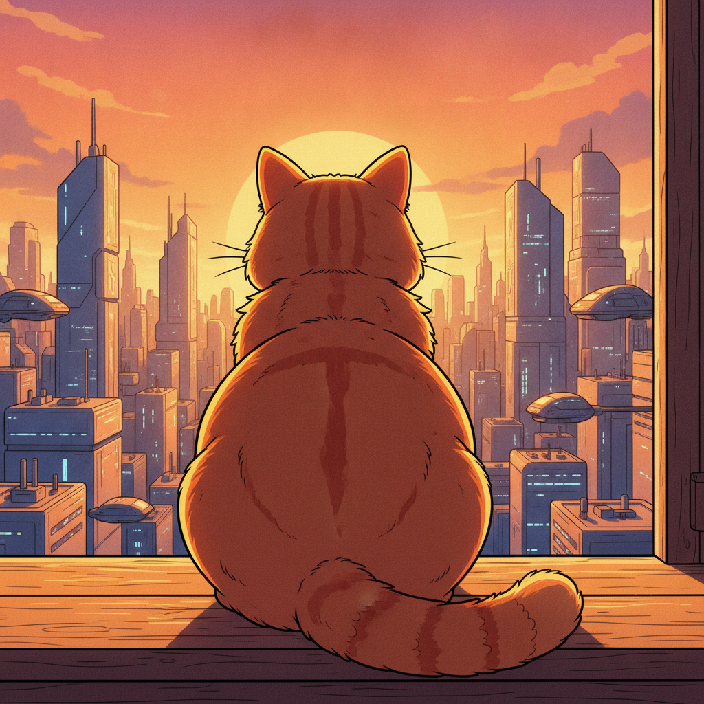
Golden Hour Window
How AI Text-to-Image Generation Works
Three steps, and the third is where an adequate image becomes the one you pictured.
Describe The Image
Pick a starting style below, then write your subject on top of it. Six presets cover photoreal, flat vector, isometric 3D, watercolour, macro and anime, and each carries a full prompt behind it so the medium is already specified in the detail the model needs.
Generate At Up To 4K
The render comes back in roughly fifteen seconds. Nothing is retrieved from a library — the image is composed for your specific wording, which is why nobody else has it and why two people describing the same subject get two different pictures.
Change One Clause And Repeat
Almost no first render is final. Swap only the lighting, or only the viewpoint, and regenerate. Isolating one variable tells you which part of your wording is carrying the result, and three iterations usually get you where a full rewrite would not.
Keep a house style block
Medium, palette, lighting and detail level saved as one block you paste ahead of each subject. It is what makes fifty generated images look like one brand instead of fifty experiments.
Always keep the 4K master
Generate full size even for a small slot. Cropping down from a large file stays sharp; upscaling a small one after someone asks for a banner version does not, and you find out late.
Isolate one variable
When a render is close but wrong, resist rewriting everything. Change only the light, or only the camera angle, and you learn which clause was actually carrying the image.
The Six Layers Of A Text-to-Image Prompt
Almost every disappointing render comes from leaving one of these layers unspecified and inheriting the model's default instead.
| The layer | What to write | Why it matters |
|---|---|---|
| Subject | Name the thing and its state | The noun on its own is the weakest possible instruction. A cup, a valley, a workspace — each covers thousands of images. Add material, colour, condition and what it is doing, and the model has something specific to build rather than an average to fall back on. |
| Setting | Put it somewhere | Subjects floating on a neutral background are the default when no environment is given, and that default is rarely what anyone wanted. A surface, a room, a landscape or an explicit studio backdrop all count — the point is to make the choice yourself rather than inherit it. |
| Lighting | Pick a source and a direction | This is the clause most people omit and the one that changes the picture most. Soft morning window light from the left, hard midday sun, overcast diffusion, warm golden hour and cold moonlight produce five unrelated images from otherwise identical wording, because light is what defines form. |
| Viewpoint | Decide the camera before the style | Eye-level, low angle looking up, flat overhead, isometric three-quarter, tight macro crop — the framing is a decision made before any styling is applied. Stating it stops the generator defaulting to the same centred mid-shot for every prompt you write. |
| Style & finish | Name a medium, not a mood | Beautiful and professional are not styles. Product photography, flat vector screenprint, isometric 3D render, loose watercolour, cel-shaded anime and oil painting are, and each carries its own conventions for edges, colour and detail that the model already knows. |
| Detail & exclusions | Add last, and say what to leave out | Small specifics — a palette, a texture, a prop — belong at the end so they refine rather than dominate. This is also where exclusions go: asking explicitly for no text, no logos and no watermark is the reliable way to keep stray lettering out of an image meant to carry your own type. |
You will not need all six on every prompt. Specifying the two or three your current render is getting wrong is usually enough to move it where you want it.
What Creators Use AI Text-to-Image Generation For
Six jobs it genuinely replaces, and the approach that suits each one.
The problem with illustrating a blog is not any single image, it is that fifty posts illustrated one at a time look like fifty different websites. Write a house style once — the medium, the palette, the lighting, the level of detail — and keep it as a block you paste ahead of each post-specific subject. Text-to-image generation then produces headers that vary in content but hold together as a set, which is what actually makes a blog look designed rather than assembled.
Paid social rewards volume and iteration far more than polish. Because a render takes about fifteen seconds, the sensible approach is to produce six versions of a concept — different palettes, different framings, different moods — and let the numbers pick the winner rather than arguing about it in advance. The one habit worth keeping is to generate at full resolution and crop per placement afterwards, since every network wants a different aspect ratio.
A mockup lives or dies on material and lighting, not on the object outline. Matte versus gloss, brushed metal versus soft-touch plastic, the softness of the shadow and where the highlight falls are the clauses that make a rendered product look photographed. This is also the case where consistency matters most — a fixed description block for the product, varied only by scene, gives you a whole campaign of the same object rather than six similar objects.
Nobody has ever been persuaded by a stock illustration of two people shaking hands. Generating a specific image for a specific slide takes less time than searching for an adequate one, costs nothing per image on a plan, and avoids the quiet embarrassment of a competitor using the same photograph. For internal decks in particular, the speed is the whole argument.
The expensive part of visual work is deciding, not executing. Running eight directions past a client or a team in ten minutes settles the argument that would otherwise consume a week of revisions on a commissioned piece. Plenty of studios now use text-to-image generation purely as a briefing tool — the final art is still made by a person, but the person starts from an agreed picture instead of a paragraph.
A thumbnail is seen at a couple of hundred pixels wide next to a dozen competitors, so contrast and shape legibility beat detail every time. Bold flat styles, strong single subjects and high-contrast palettes survive that shrink; delicate painterly work does not. Ask for the composition weighted to one side and you leave room for a title without covering the subject.
What This Text-to-Image Tool Does Differently
The gaps that used to make generated images unusable for real work — lettering, consistency and resolution — are the ones worth checking first.
Text That Reads As Text
The old failure of text-to-image generation was lettering — plausible letterforms spelling nothing, which ruled out posters, packaging, labels and any graphic where a headline carries the message. Nano Banana Pro renders specified words legibly, so a sign, a product label or a title comes back as characters rather than decoration. Put the exact wording in quotes, keep it short, and say where in the frame it sits.
The Same Subject, Image After Image
Your prompt is sent through as written instead of being paraphrased and expanded first, which is exactly what turns a saved description block into a working design document. Paste an identical character or product description into ten prompts and you get ten pictures of one subject rather than ten related subjects — the difference between running a campaign and collecting samples.
4K Output, Not Screen-Sized
Every render can come back at up to 4K, which covers blog headers, ad creative, presentation slides and physical prints at ordinary poster sizes. Generate at full resolution even when the immediate slot is small: cropping down from a large master stays sharp, while upscaling a small file after a client asks for a banner version never fully recovers the detail.
Any Medium, One Interface
Photorealism, flat vector screenprint, isometric 3D, watercolour, macro photography and cel-shaded anime are six unrelated visual traditions, and all six on this page came from the same tool with nothing changed but the words. That range is what makes text-to-image generation practical for a whole brand rather than for one aesthetic.
Fifteen Seconds Per Iteration
Speed is a creative feature rather than a convenience one. When a render takes a quarter of a minute, changing a single clause to see what it controls becomes free, and you learn the craft by experiment instead of by reading prompt guides. Long queue times push people toward accepting the first adequate result, which is the real cost.
Plain English, No Prompt Syntax
There are no weights, no negative-prompt fields, no colons and no double colons to learn. Describe the picture in ordinary sentences the way you would brief a photographer or an illustrator, and add exclusions in plain words when you need them. The skill that transfers here is art direction, not syntax.
Choosing A Medium For Text-to-Image Generation
Pick by where the image ends up, not by which preview looks nicest on its own.
Photorealistic
The right default for product shots, mockups and anything that needs to read as a real object. Carries material detail well at size, and lives or dies on how precisely you describe the surface and the light.
Flat Vector & Watercolour
Illustration styles survive being shrunk, which makes flat vector the safe pick for thumbnails, icons and social tiles. Watercolour trades that legibility for warmth and leaves natural space for type.
Isometric 3D
The standard look for explaining a system, a workspace or a process without a diagram. Clean, friendly and quietly technical — it reads as designed rather than photographed, which suits product marketing.
Macro & Anime
Macro gives you abstract texture for backgrounds and hero panels where a literal subject would distract. Anime and cel-shaded work carries a specific audience with it, so use it where that audience is who you are addressing.
AI Text-to-Image Generation FAQ
Write It, Then Look At It
Start with a medium, add a subject and a light source, and see what comes back. Fifteen seconds, no account, and three iterations will teach you more about prompting than any guide.
Generate From Text FreeGetting More Out Of AI Text-to-Image Generation
The mental model that makes AI text-to-image generation click is that you are specifying rather than searching. Nothing is being retrieved and nothing is being filtered — the image is composed from scratch to match the description you wrote, which is why the wording carries all the weight and why the same three words produce a different picture every time you run them. That is also why the failure mode is so consistent: an underspecified prompt does not return an error, it returns the model's default for whatever you left out. A cup with no stated surface lands on a neutral background. A scene with no stated light gets flat, even illumination. The craft is not in finding magic words, it is in noticing which of the six layers you forgot to write down.
Working in layers is what turns that from theory into a habit. Subject, then setting, then lighting, then viewpoint, then medium and finish, then small details and exclusions. Lighting deserves particular attention because it is the clause most often omitted and the one that changes the image most — soft morning window light, hard midday sun, overcast diffusion and cold moonlight will give you four unrelated pictures of the same object. The second habit is iterating by single variable. When a render is close but wrong, change one clause and regenerate rather than rewriting the prompt, because a full rewrite teaches you nothing about which part was working. At roughly fifteen seconds per image, that kind of controlled experiment is effectively free, and it is how people who are good at text-to-image generation actually got good at it.
For production work, two things separate a usable set of images from a folder of nice individual ones. The first is a house style block: medium, palette, lighting and detail level written once and pasted ahead of every subject-specific prompt, so that fifty blog headers or a full ad campaign hold together visually. The second is subject consistency — a fixed description of a character or a product, reused unchanged while only the scene around it varies. Because prompts here are passed through as written rather than paraphrased and expanded first, an identical block reliably produces a recognisable subject across a whole set. Generate at full 4K regardless of the immediate destination, keep the masters, and crop per placement afterwards; the reverse order is the mistake that shows up only when someone asks for a print version. If you intend to sell the output, commercial use is included on paid plans from $2.99, but avoid prompting for copyrighted characters or trademarked logos and check the disclosure rules of whichever marketplace or ad network the work is headed for.
If you would rather skip the theory, the text to image page is the direct version of this tool, and text-to-image vs image-to-image is the page to read when you already have a photo and want to change it rather than start from nothing. The general AI image generator covers everything at once, while the full set of AI image tools breaks out the specialised jobs — logos, headshots, product shots, restoration and the rest. Everything runs in the browser with nothing to install, and the AI text-to-image generation tool above is free to try before any of that matters.