
WCAG Compliant Image Generator
Generate visuals that clear the contrast thresholds, carry meaning in more than colour, and keep icons and focus states visible — accessible image tools that start compliant instead of getting fixed in audit.
Try It Now — Free
Pick the accessibility problem you are solving, describe your asset, and generate. Then verify the real contrast numbers against the background you will actually ship.
WCAG Compliant Image Generator
Choose an accessibility preset, describe your asset, and generate visuals built around WCAG 2.2 Level AA
Accessible Image Tools Output, Straight From the Generator
Six presets, six results, no retouching. Each image below came out of the tool on this page using the preset named on its card.




The WCAG Criteria These Presets Are Built Around
Six success criteria that images can actually fail — and what each preset does to keep your asset on the right side of them.
Contrast Minimum — 1.4.3
Normal text needs 4.5:1 against its background, large text 3:1. This is the single most-failed criterion in every large-scale accessibility survey, and it is almost always introduced at the design stage rather than in code. The contrast presets generate with headroom above the threshold so the asset survives being placed on a slightly different background.
Use of Colour — 1.4.1
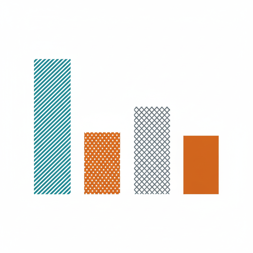
Colour must never be the only way information is conveyed. In practice that means chart series need hatching or dots as well as hue, error states need an icon as well as red, and links need something beyond colour to mark them. The pattern-differentiated preset builds that redundancy in from the first generation.
Non-Text Contrast — 1.4.11
Icons, chart bars, input borders and other graphical objects need 3:1 against what surrounds them. Thin decorative strokes are the usual casualty — a 1px hairline in mid-grey looks refined in a mockup and disappears entirely for a low-vision reader on a bright screen.
Focus Appearance — 2.4.11 / 2.4.13
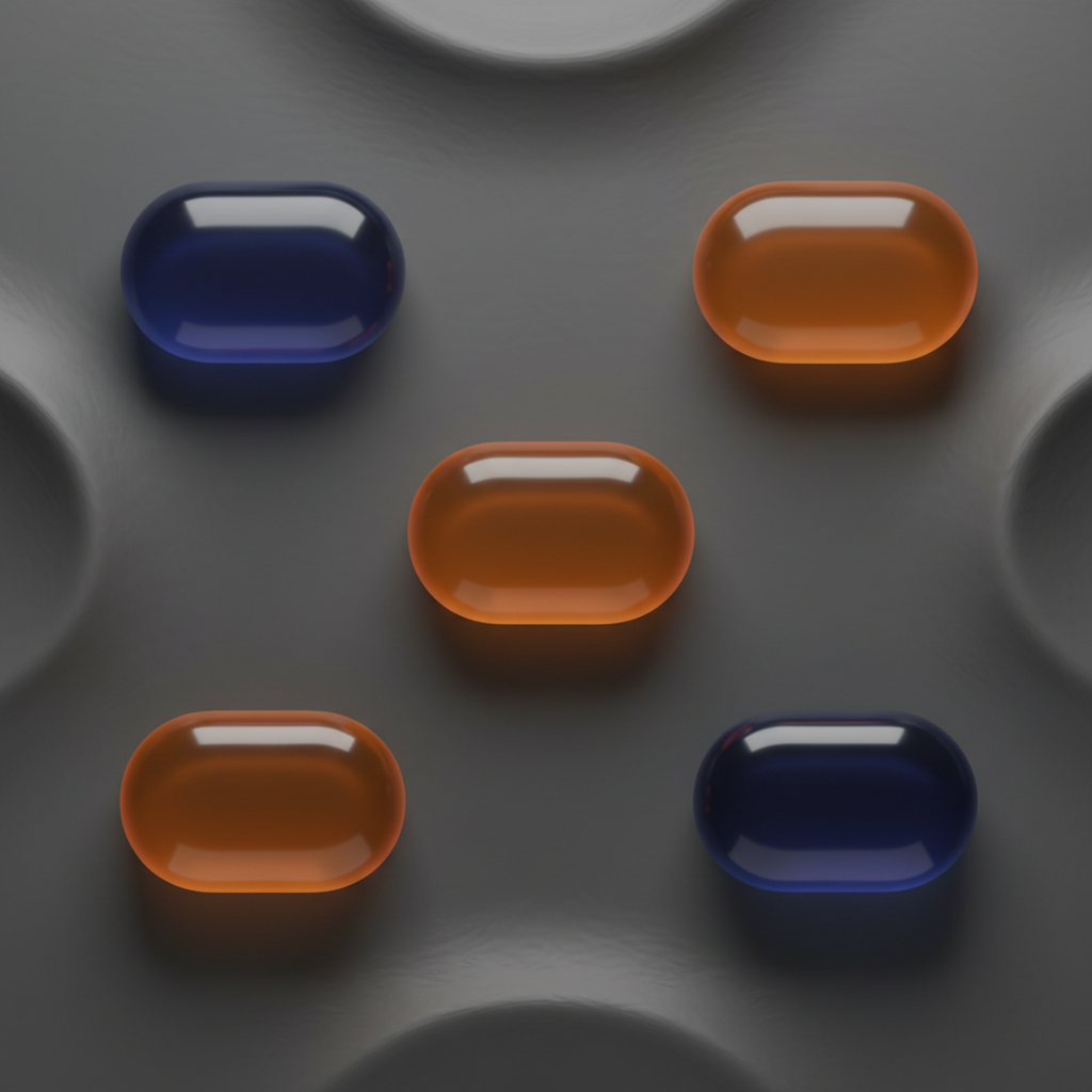
Keyboard users need to see where they are. WCAG 2.2 tightened this considerably: the focus indicator must be clearly visible and sufficiently thick, not a faint one-pixel outline. The focus-state preset renders bold, high-contrast rings you can measure against the guidance before you build them.
Target Size — 2.5.8
Interactive targets should be at least 24 by 24 CSS pixels, with more recommended for primary actions. Cramped button rows are a design decision, not an engineering one, so generating layouts with honest spacing from the start prevents the argument later.
Images of Text — 1.4.5
Real text beats an image of text almost every time, because it can be resized, restyled and read aloud. When you do need type inside an image — social cards, hero art, mockups — keep it large and high contrast, and always supply the same words as real text or alt text in the page.
How the WCAG Compliant Image Generator Works
Pick the criterion you are designing for
Choose the preset that matches the problem — high-contrast palette, colorblind-safe series, thick-stroke icons, visible focus state, generous targets or legible large type. Each one encodes the relevant WCAG threshold so you are not describing accessibility from a blank prompt box.
Describe your actual asset
Add the real subject — your onboarding illustration, a quarterly comparison chart, a settings icon row, a hero banner. Name your brand colours if you have them and the generator will work within them rather than replacing your identity with generic accessible defaults.
Verify, then write the alt text
Download the result and check the real numbers with a contrast checker against the background you will actually use. Then write alt text that conveys the purpose the image serves. Generation gets you a compliant-looking asset; those two steps are what make it genuinely accessible.
What These AI WCAG Tools Actually Give You
Six capabilities that decide whether compliant image creation is a checkbox exercise or a real part of your accessibility practice.
Contrast-First Presets, Not Contrast-Checked Afterwards
Most accessibility workflows generate a pretty asset and then discover in audit that it fails. This WCAG compliant image generator inverts that: every preset carries explicit contrast language, high-separation palettes and clear figure-ground instructions into the prompt itself, so the first output already sits in the passing range instead of needing a rescue pass in a design tool.
Colorblind-Safe by Construction
The palette preset separates hues along blue-versus-orange axes rather than red-versus-green, and varies lightness between adjacent elements so a series still reads in greyscale. Around one in twelve men has a colour vision deficiency, which makes colour-only encoding one of the highest-impact and most commonly missed accessibility failures in real products.
Redundant Encoding for Data Graphics
Accessible charts carry meaning twice. The pattern-differentiated preset generates bars, areas and segments with distinct textures — hatching, dots, crosshatch, solid — alongside distinct colours, satisfying the use-of-colour criterion visually. Pair the result with an accessible data table and the chart works for everyone reading the page.
4K Output That Holds Its Edges
Accessibility depends on crisp boundaries. Compression mush and upscaling artefacts eat the very edge definition that gives an icon its 3:1 non-text contrast. Paid plans render at 4K, which keeps thick strokes thick and focus rings sharp when the asset is exported for print, retina displays or presentation screens.
Image-to-Image for Remediating What You Already Ship
The most common accessibility job is not greenfield — it is fixing an existing library. Upload a current illustration, banner or chart and ask for higher contrast, thicker strokes or pattern-coded series while keeping the composition and brand intact, so the remediated version still looks like it belongs beside everything else.
Honest About What Automation Cannot Do
No generator can certify conformance, and this one does not pretend to. Accessible image tools remove predictable visual failures at source; they cannot judge whether your alt text conveys purpose, whether focus order makes sense, or whether the page works with a screen reader. Automated checks catch roughly a third of issues — the rest still needs a human and, ideally, disabled testers.
Where AI Accessibility Work Pays for Itself
Four situations where generating for accessibility up front is cheaper than remediating later.
Design systems and component libraries
Generate the illustrative and iconographic layer of a system against accessibility thresholds from day one. Retrofitting contrast across an established library is expensive and politically hard; getting it right in the first release costs nothing extra.
Public sector and regulated procurement
Government, education and healthcare buyers increasingly require documented WCAG 2.1 or 2.2 AA conformance, and the European Accessibility Act extends similar expectations to a wide range of consumer services. Assets that already clear the visual criteria remove a recurring source of audit findings.
Dashboards, reports and data storytelling
Analytics work leans heavily on colour to separate series, which is precisely where colour vision deficiency bites. Pattern-coded generation gives you chart art and report figures that survive both greyscale printing and a reader who cannot distinguish your palette.
Remediation sprints on existing products
When an audit lands with three hundred contrast findings, the bottleneck is producing replacement assets fast enough. Image-to-image remediation lets a small team regenerate an entire illustration set at passing contrast in an afternoon rather than a quarter.
WCAG Compliant Image Generator — Common Questions
A WCAG compliant image generator is an AI image tool whose prompts and presets are written around the Web Content Accessibility Guidelines rather than around a look. Instead of asking for "a nice chart", you generate visuals that already respect the things WCAG cares about: contrast ratios that clear 4.5:1 for normal text and 3:1 for large text and graphical objects, meaning carried by shape and pattern rather than by colour alone, generous touch targets, and clearly visible focus states. The output is a starting asset that is far closer to compliant than a default generation, which is where most of the rework in accessible design comes from.
Generate It Accessible the First Time
Free trial credits, no credit card, no signup wall. Take one asset that failed your last audit and regenerate it at passing contrast in under a minute.
Start Creating FreeUnderstanding the WCAG Compliant Image Generator
Accessibility failures in imagery are boringly predictable. Year after year, automated surveys of the top million home pages find low-contrast text on the overwhelming majority of them, and contrast has held the top spot on that list for as long as the surveys have run. The other repeat offenders are equally familiar: information encoded in colour alone, decorative hairline icons that vanish for low-vision readers, focus indicators so faint that keyboard users lose their place, and images of text that cannot be resized. None of these are hard problems technically. They are design defaults, which is exactly why a WCAG compliant image generator that carries the thresholds into the prompt is more useful than another checker that tells you after the fact that you got it wrong.
The presets on this page map onto specific WCAG 2.2 success criteria rather than onto a vague notion of accessible style. High-contrast palette targets 1.4.3 with headroom above the 4.5:1 requirement for normal text. Colorblind-safe series and pattern-coded charts address 1.4.1, use of colour, by separating hues along axes that survive deuteranopia and protanopia and then adding texture so the encoding is redundant anyway. Thick-stroke icons target 1.4.11, non-text contrast, where graphical objects need 3:1 against their surroundings. Visible focus state reflects the tightened focus appearance guidance in WCAG 2.2, and generous target layouts reflect 2.5.8. Inclusive design AI is at its most useful when it is specific like this — a generic instruction to "make it accessible" produces the same washed-out beige output every time.
It is worth being precise about the limits. Accessible image tools cannot certify conformance, because conformance is a property of a page rather than a file. Automated tooling of any kind catches roughly a third of real accessibility issues; the rest require a person navigating with a keyboard, a screen reader, magnification or voice control. A generated image also cannot be parsed by assistive technology, so a chart rendered as a PNG still needs an accessible data table or text summary behind it, and every informative image still needs alt text that conveys its purpose rather than its appearance. Compliant image creation removes a category of visual defect at source. It does not remove the obligation to test with the people who are affected.
Used with that framing, AI WCAG tools fit naturally into the two moments where accessibility work is usually most expensive: building a new design system, and remediating an existing one after an audit. In both cases the bottleneck is producing assets that pass without abandoning the brand, and image-to-image regeneration handles exactly that — same composition, same identity, higher contrast and thicker strokes. The generator on this page is free to try with no signup, renders in seconds, and supports 4K output and full commercial rights on plans from $2.99. Start with the one asset that failed your last review, run it through the high-contrast preset, and check the result with a contrast checker. Ten minutes will tell you whether this belongs in your accessibility workflow.